
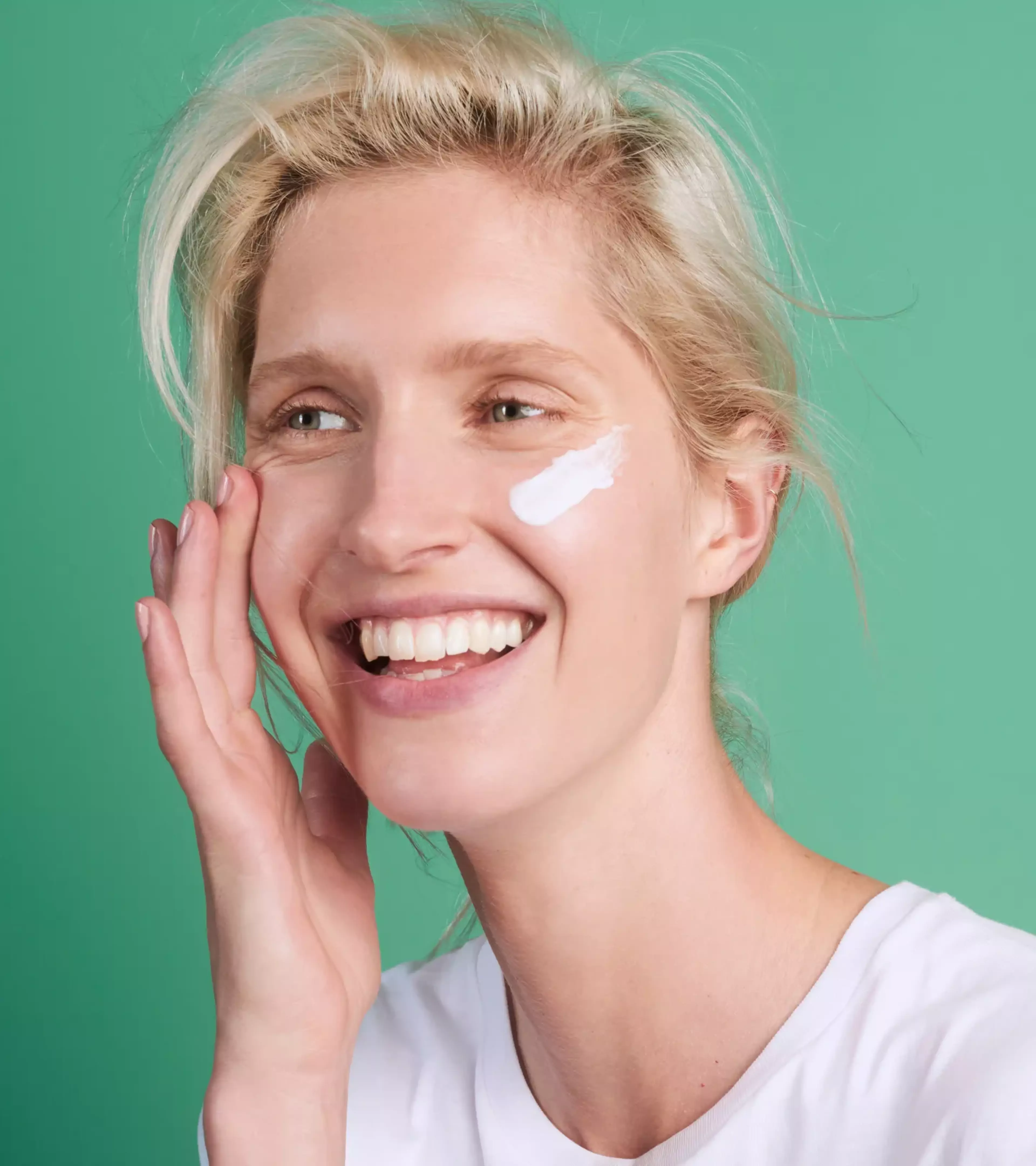
Great products that are kind for every body and nature. Changing the world of personal care. Meet Naïf.
Client
Credits
Photography by Naïf Care.
Illustrations by Josselin Bijl.
Marketing agency by Wellwood.
Project Info
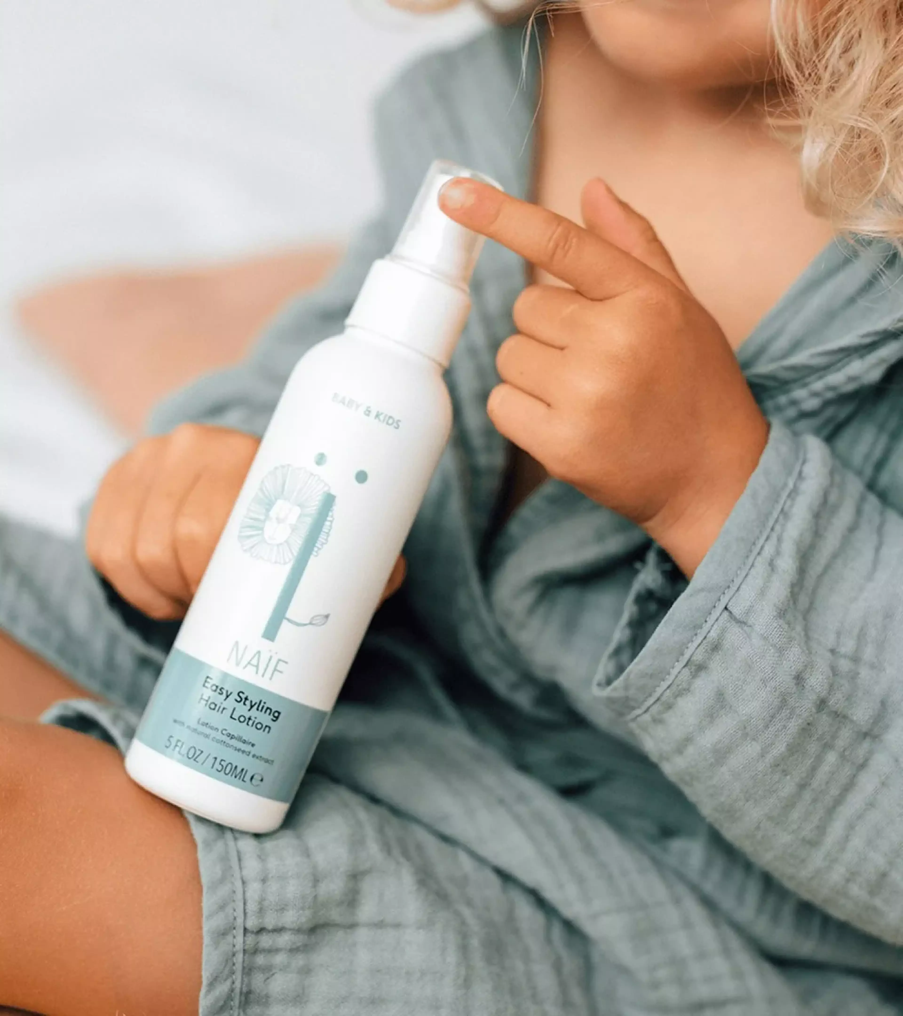
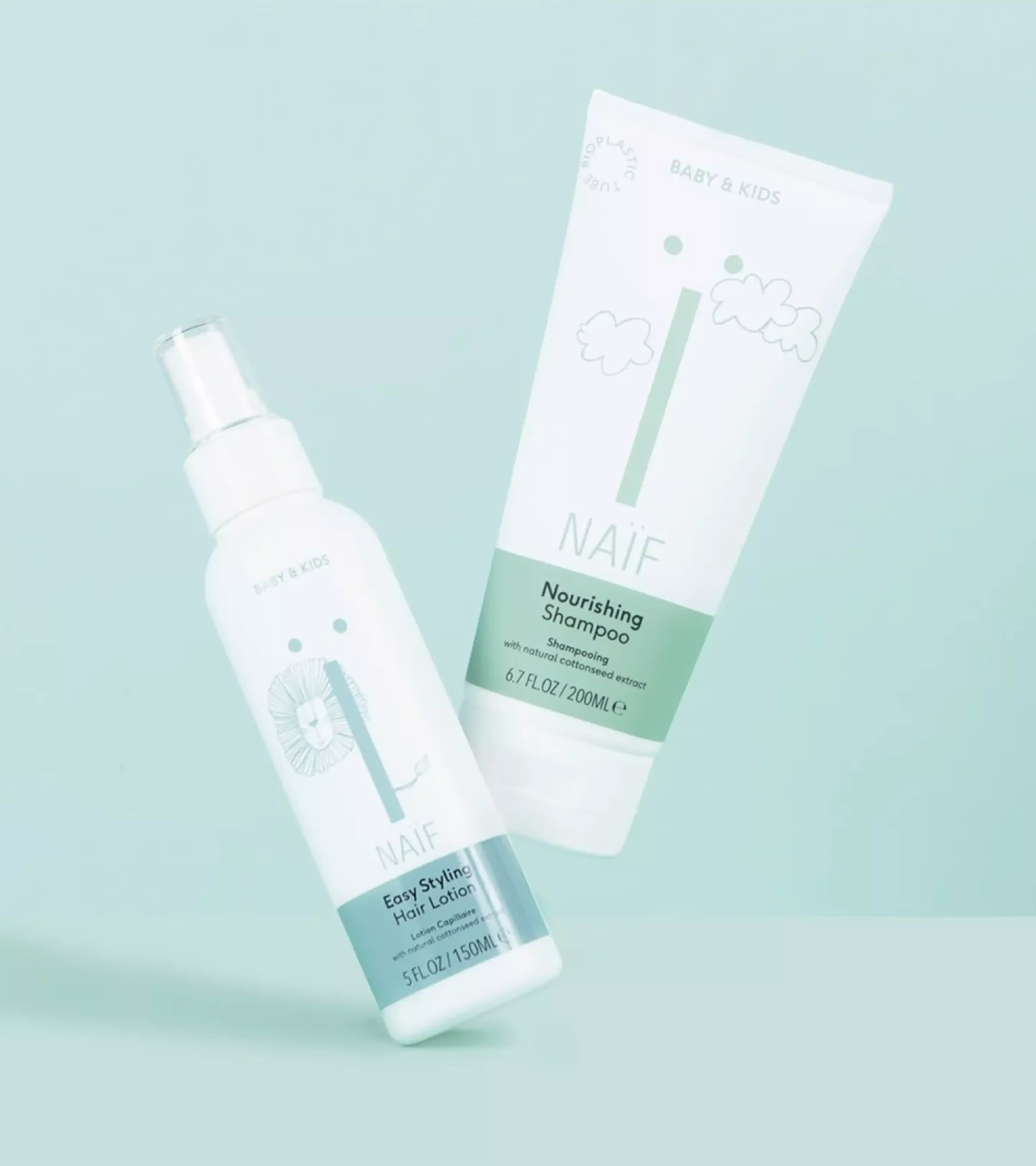
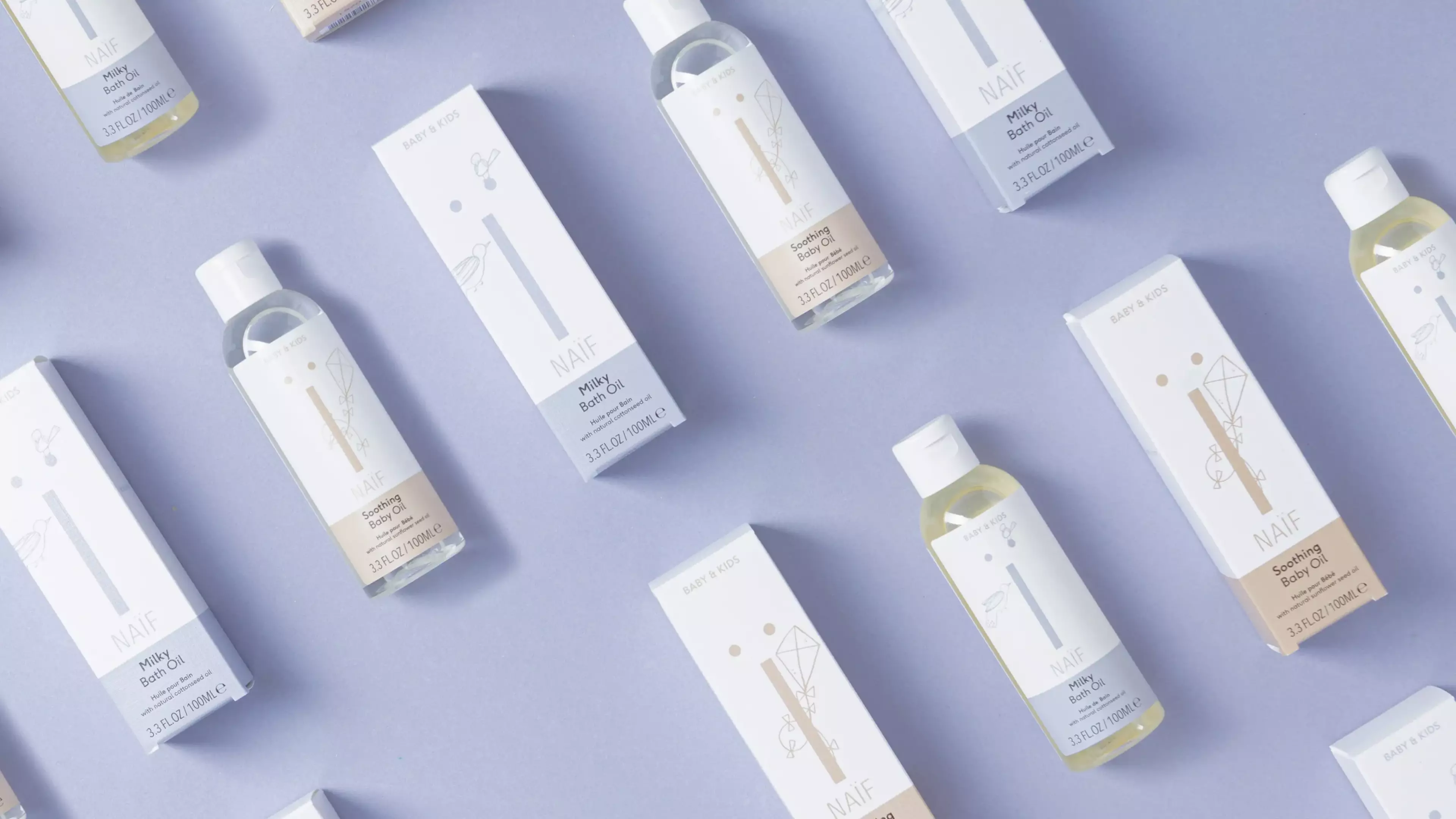
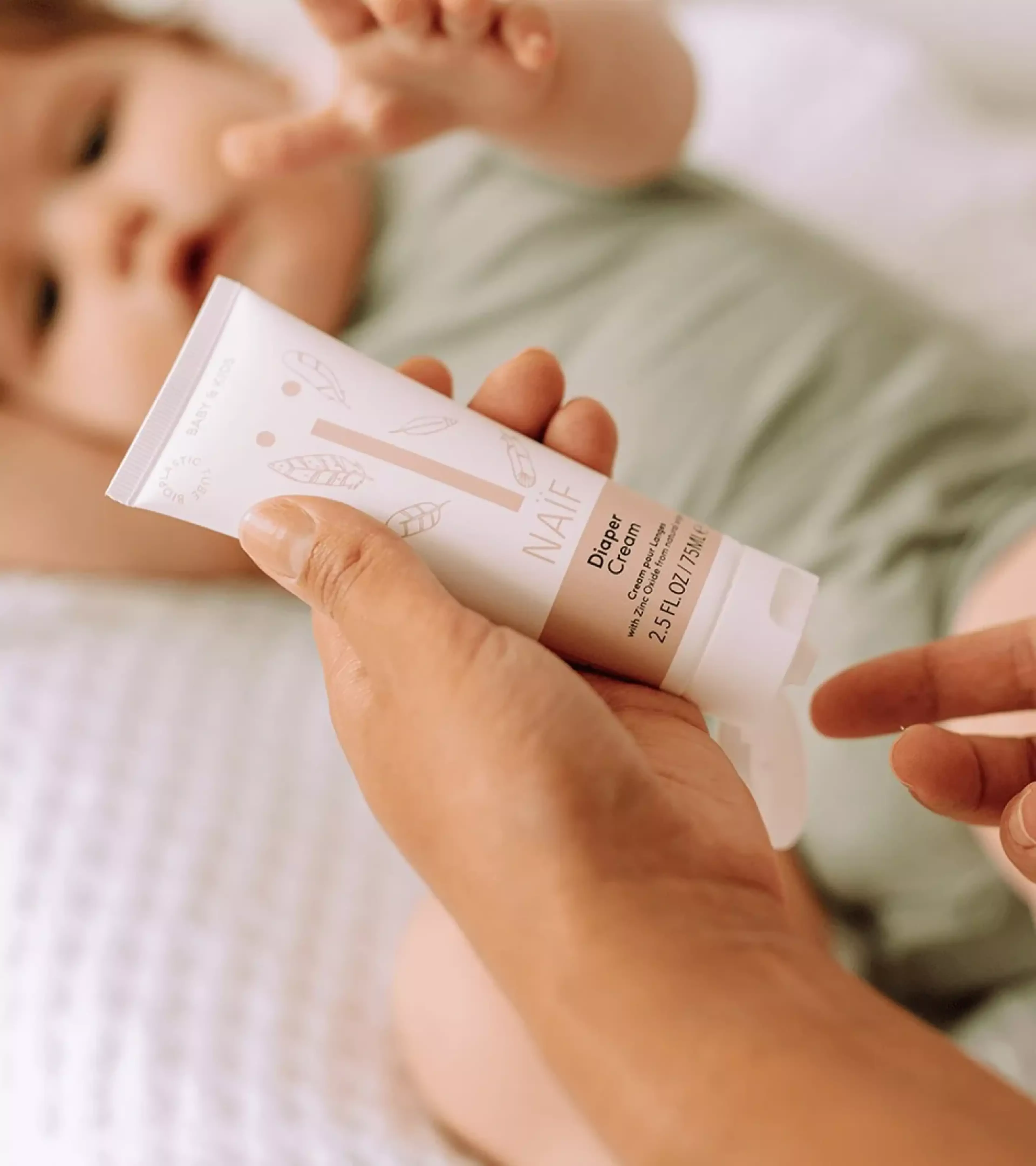
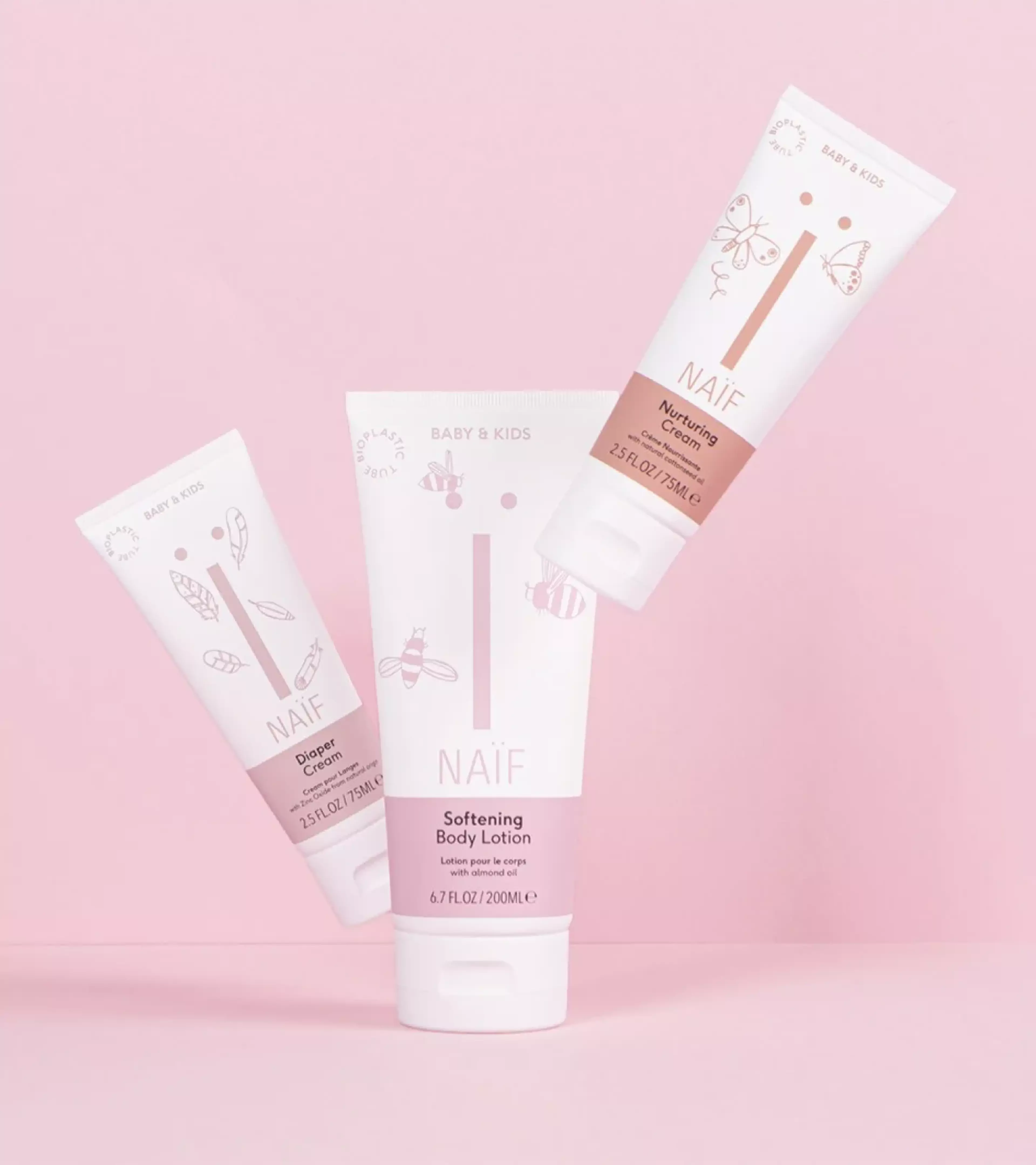
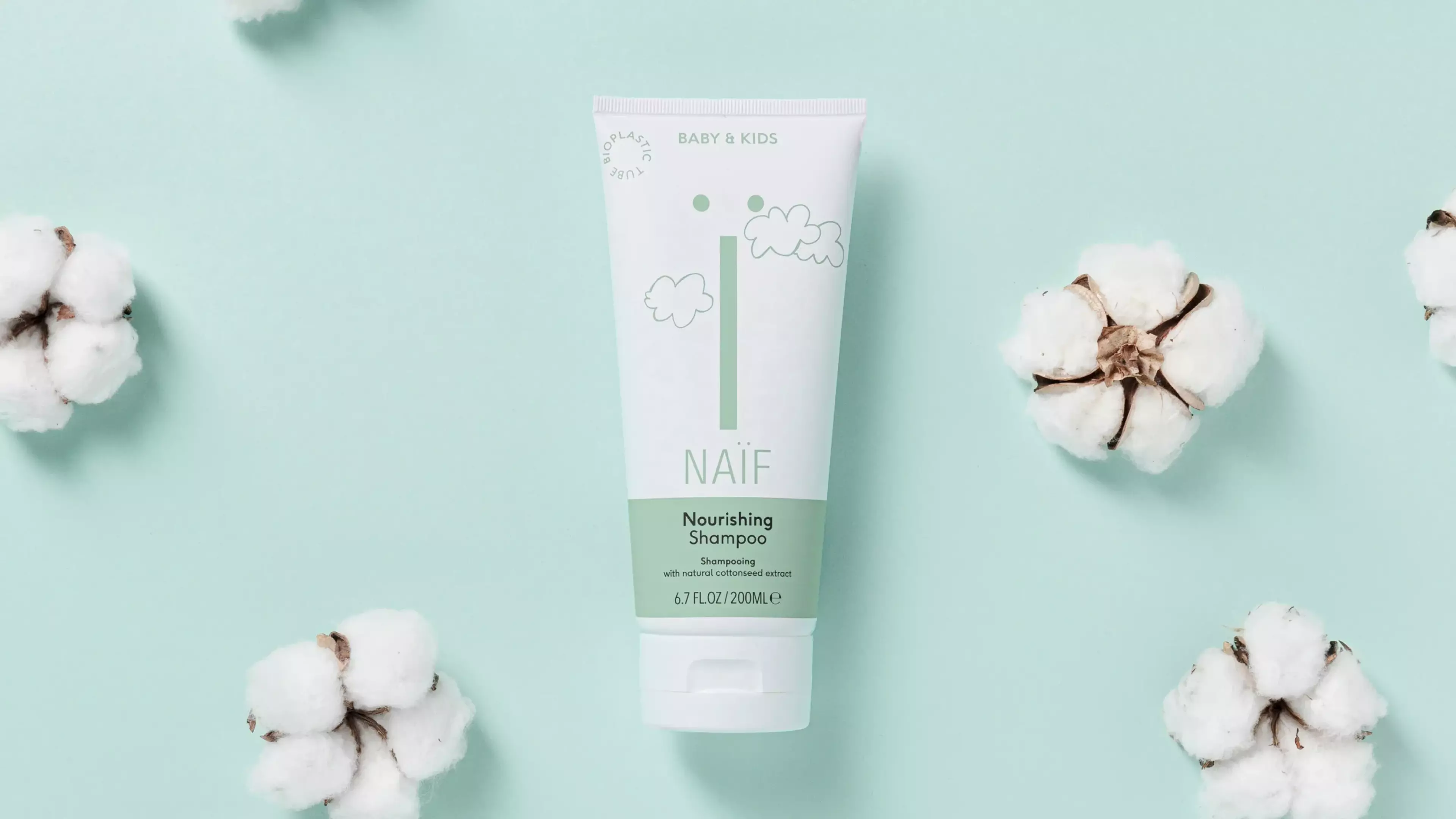
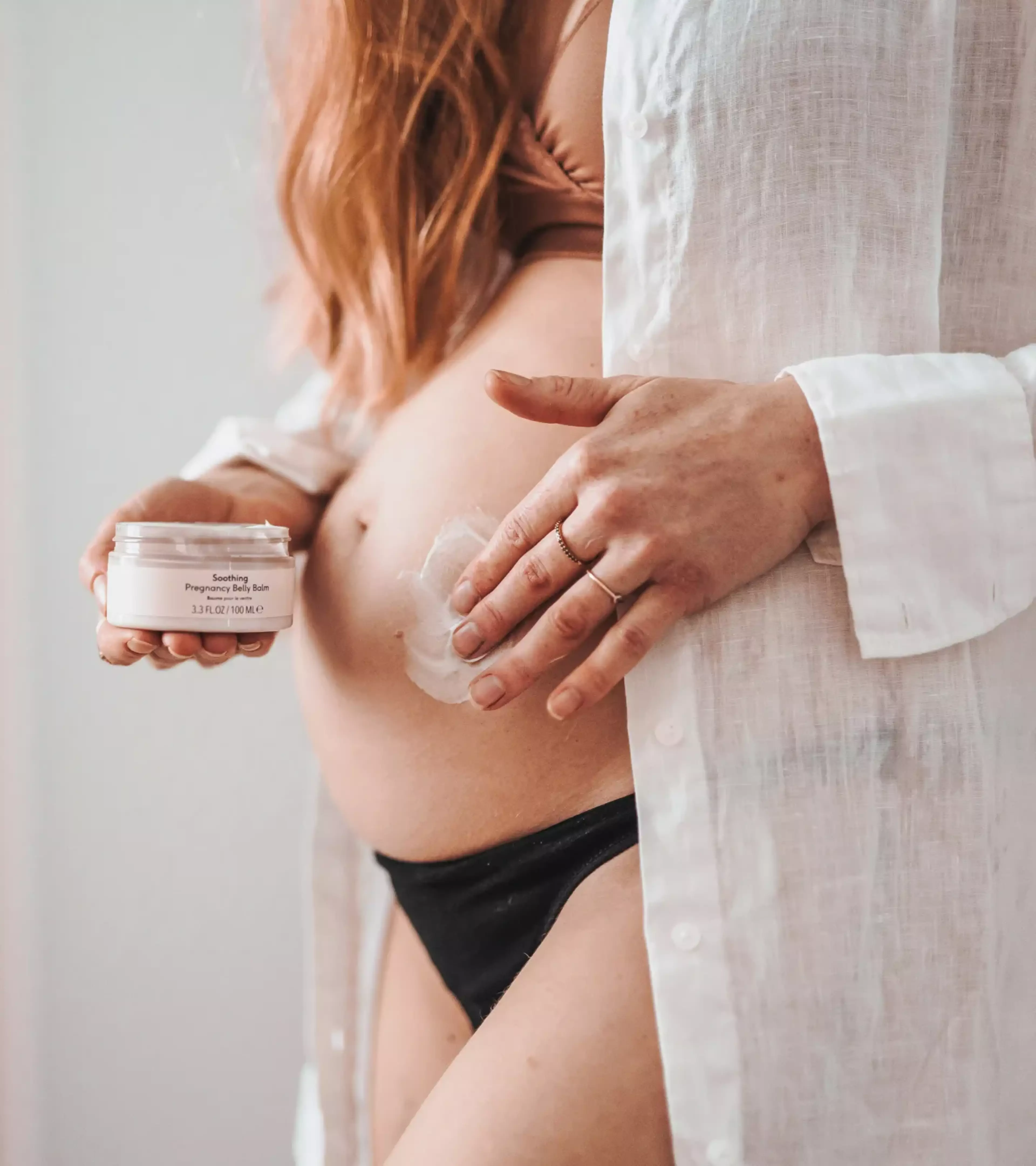
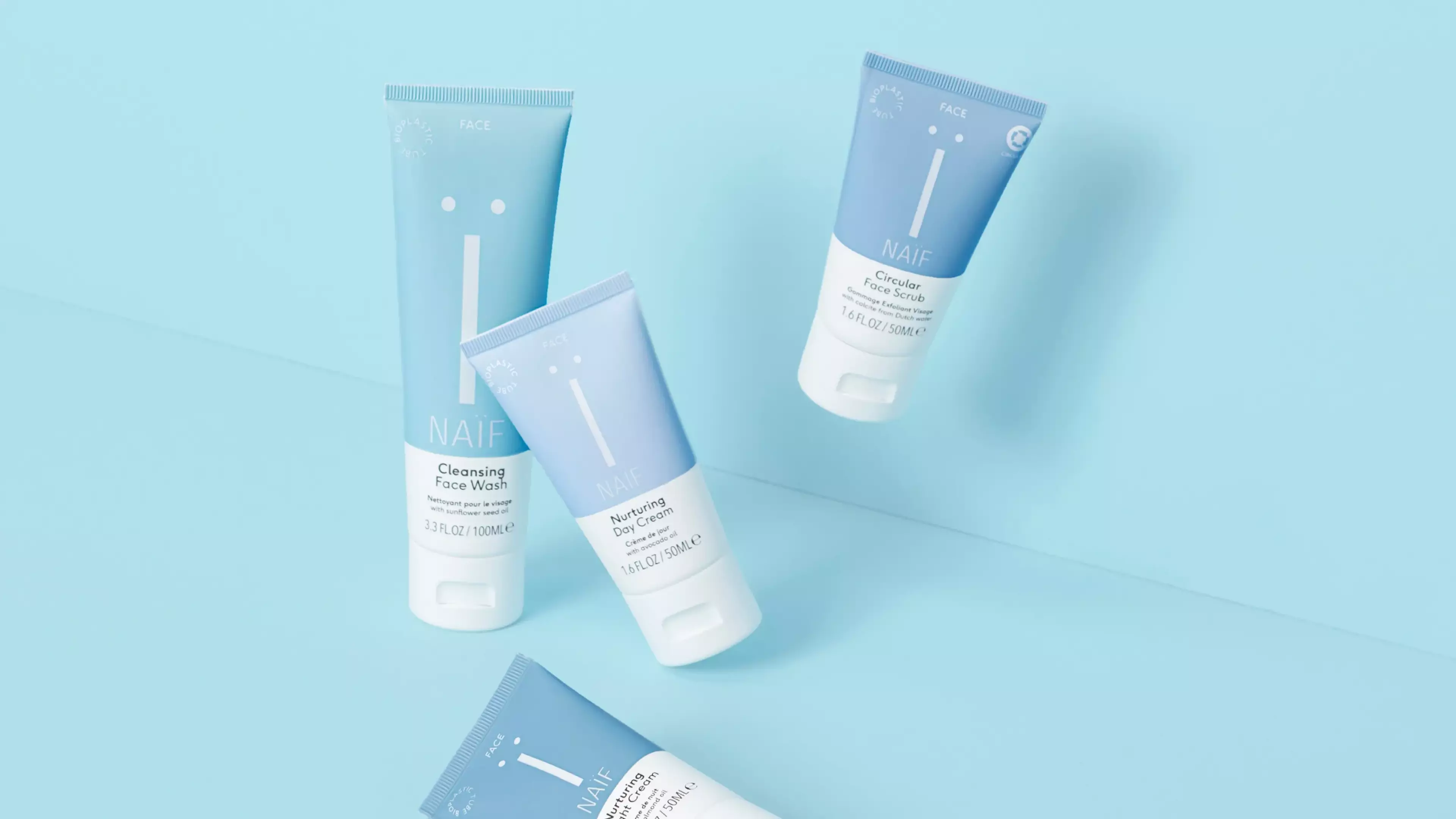
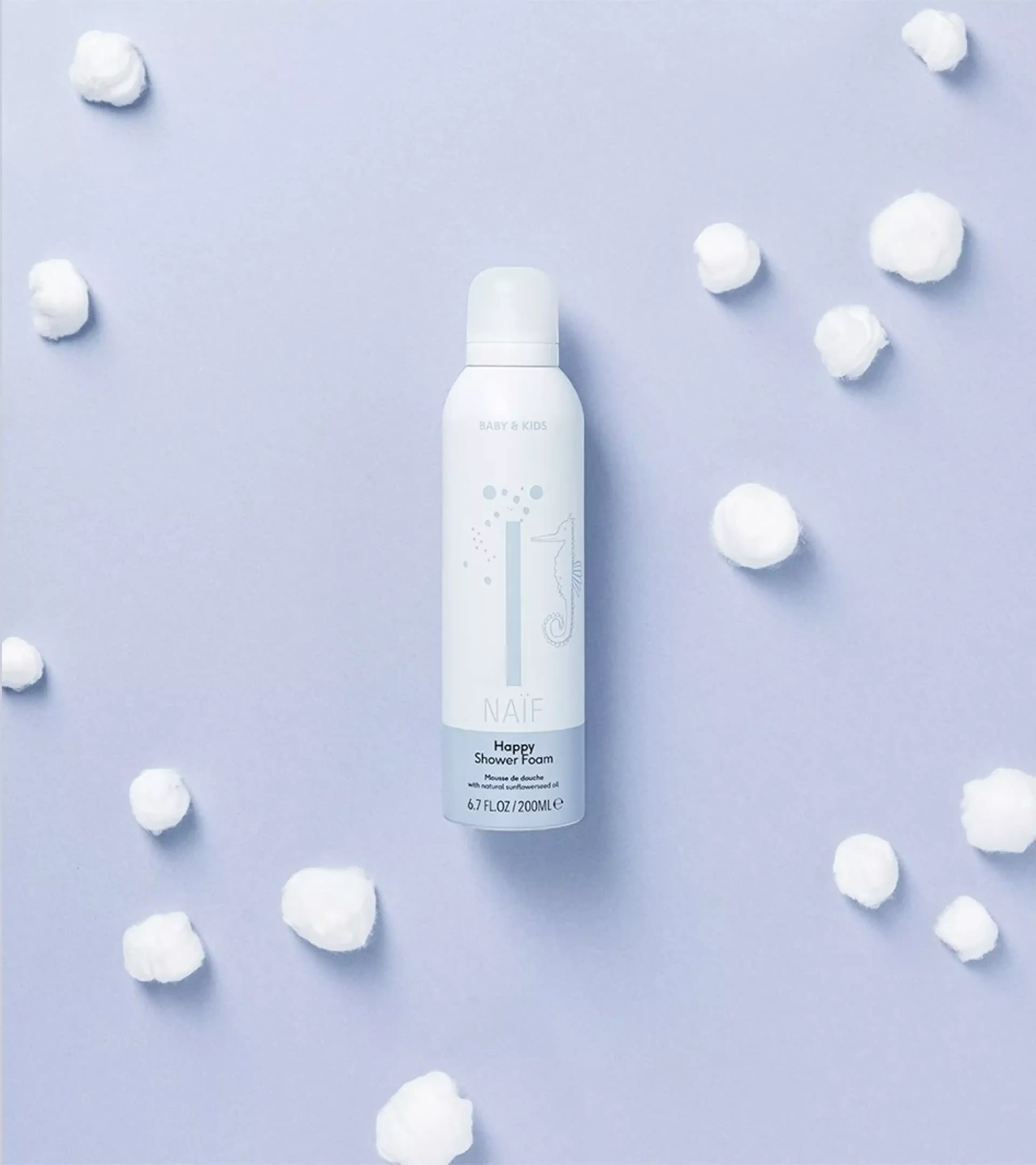
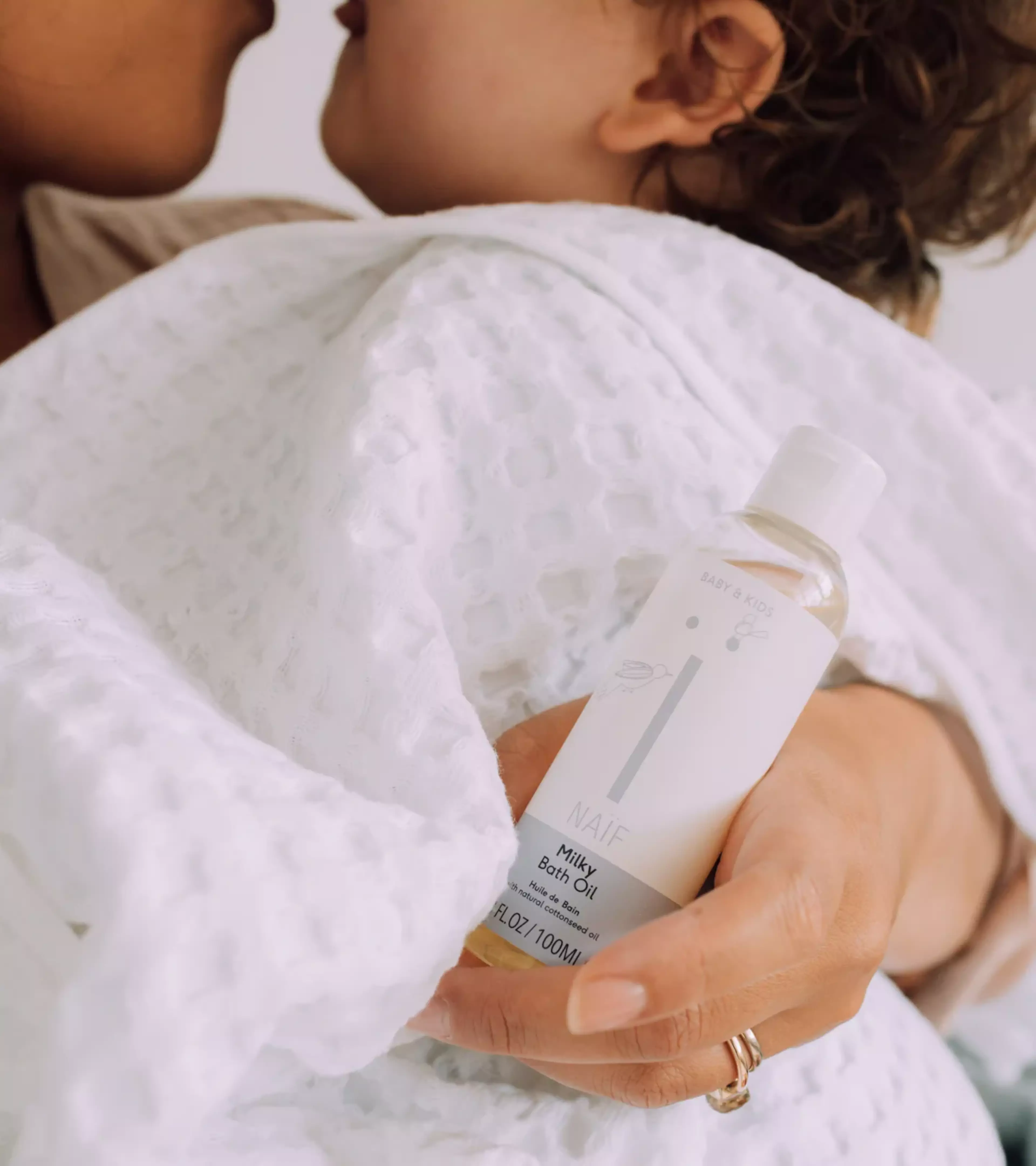
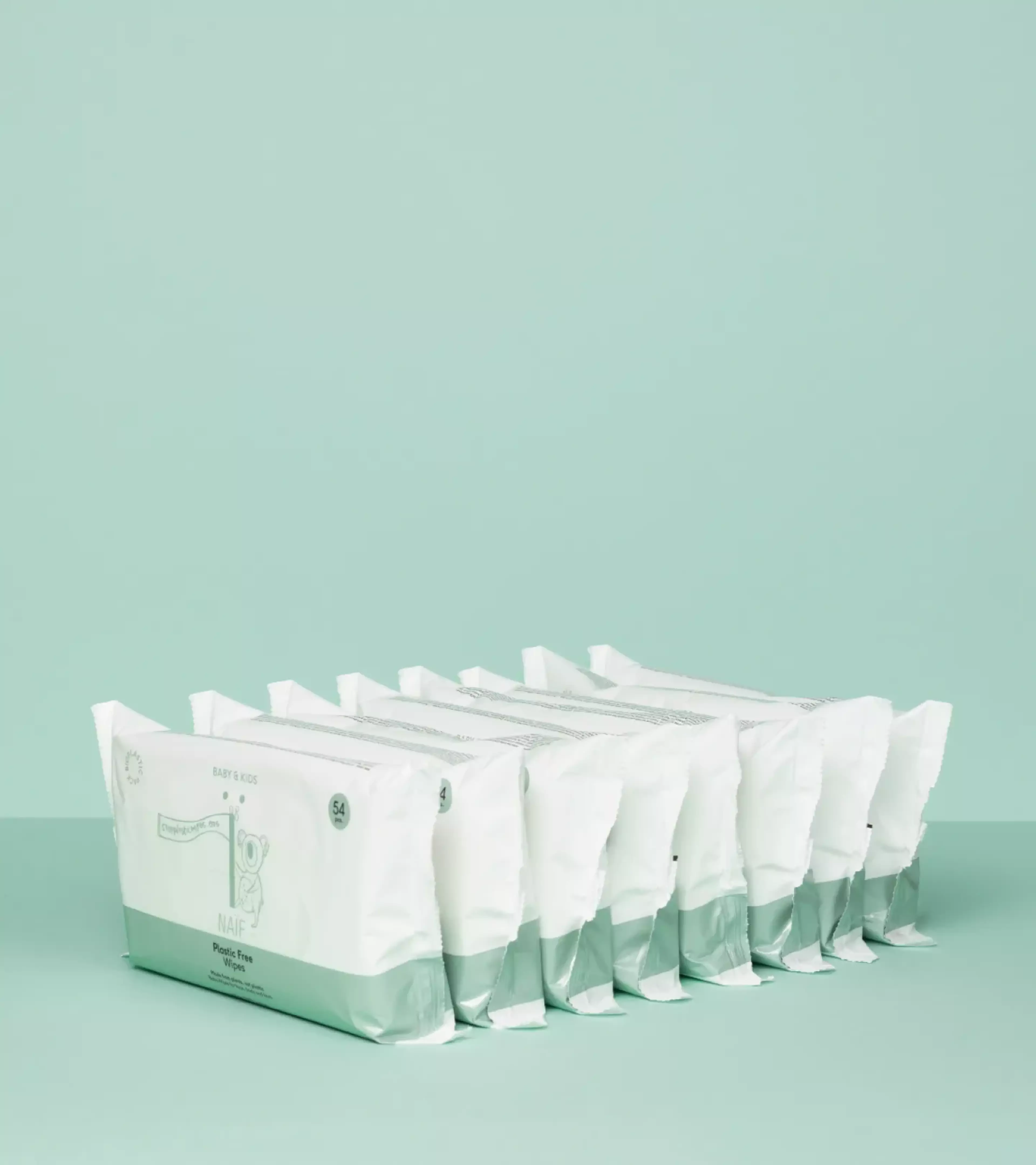
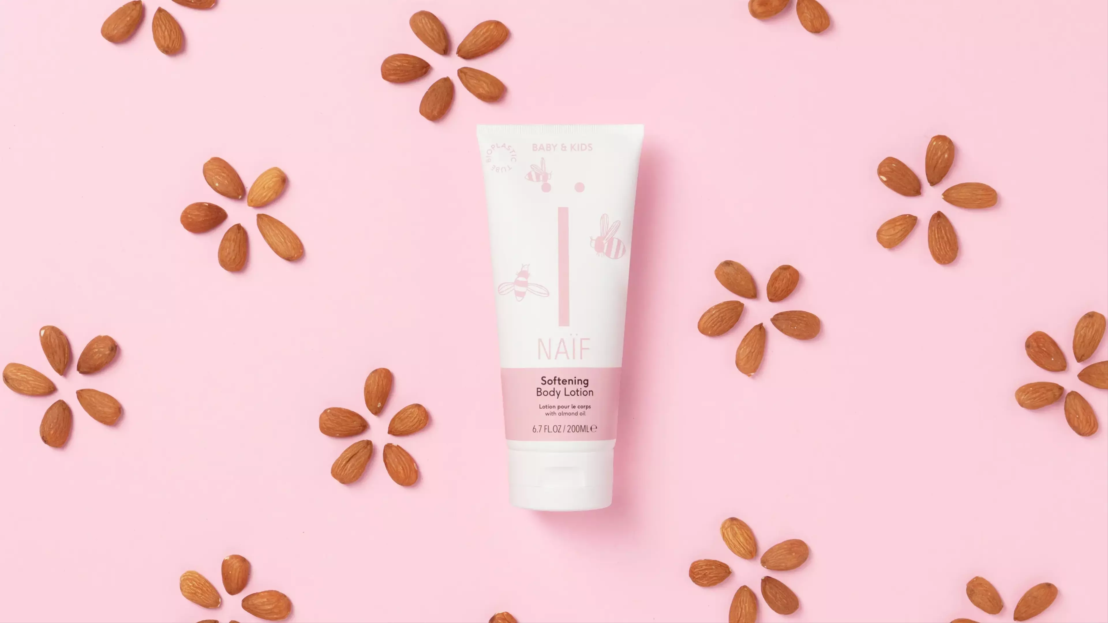
Naïf is a Dutch skincare brand that believes everybody should be able to shop naively. Carefree, without being misled by false claims and ingredients that are bad for humans or nature. For Naïf, Studio Morf worked on a rebranding and fitting packaging concept and still develops all its packaging up to this day.
Leaving out all the unnecessary - in both product, design and communication. Both the identity of Naïf and its packaging revolves around the brand’s focal point: the ïcon. A symbol that embodies the brand’s core and that functions as thé recognizable symbol for the brand in an ever growing world of skincare products. For the renewed graphic identity of Naïf it was mainly a matter of killing darlings. With a large range of output that was developed over the years, it was our task to make sure every single item communicated the newly developed brand strategy and storytelling. This resulted in a simplified yet impactful identity, giving the imagery and the brand story room to breathe. Leaving out all the unnecessary, just like they do in their natural products.

Discover More
Crafting an identity and visual image that conveys confidence, precision and effortless expertise.
Crafting an identity and visual image that conveys confidence, precision and effortless expertise.
Bold furniture for flexible living and global spaces